Building a Wardrobe from a Sustainability Perspective: Colors
- Linus Chu

- Sep 28, 2019
- 7 min read
Updated: Jan 7, 2021
This is a part of an ongoing series called 'Building a Wardrobe from a Sustainability Perspective', to access to the main page of the series, click here.

When I first decided to start this series, I had in mind that finding the right color palette is perhaps the most crucial aspect of building a personalized and long-lasting wardrobe.
This may sound less relevant to some men than me, perhaps because of my own experience in wearing more colors than the average man.
True. Men tend to start building their wardrobe with garments coming in shades of blue or grey, then slowly gravitate towards other colors such as brown, green, or oatmeal down the road.
This has perhaps become the 'universally-known' formula; because not only everyone is doing the same thing (hence it's safe to just follow suit), but also this is what many menswear publications have taught us to do as well.
Now, while I have nothing against this conventional way of building a wardrobe, I should point out that color doesn't need to be approached in a one-size-fits-all manner. After all, other than those who work in industries that have a strict color dress code, it really isn't compulsory to wear these traditional colors.
The purpose of this guide is to offer advice to those of you who are interested in wearing classic menswear with more variations in color while remaining subtle.

Let's start off by pointing out why choosing the right color palette matters for sustainability, or eco-friendly purposes.
At some point in building our wardrobe, we always ended up having that one or two items that don't seem to work with the rest of the garments/ accessories we have because of the odd shade it comes in.
My best example, again, is the red three-piece suit which I have shared on this blog for a couple of times now, especially on how it had been quite difficult to match with until very recently (more on that in this article).
Needless to say, because the only way to make good use of clothing like that is to add more that could bridge the existing gap, ultimately you would still be acquiring things which you otherwise would not need, shall you go down another path initially.
In contrast, a well-thought color palette could serve as a strict guideline for you to decide what (and what not) to add to the wardrobe from the beginning, thus preventing any wasteful purchases fundamentally.
Obviously, it is going to be more challenging to execute this ideal plan in reality, given how easy it is for us to be distracted by, for example, a remarkable tie that only comes in a certain shade or a limited edition cloth.
The point, however, is that if we could all be more conscious about these principles when we are making any purchases or commissions, we could then increase the versatility of each piece of clothing or accessory we have in our wardrobe. All in all, being 'greener' collectively.
With this sorted, let's now proceed to how to find your own color palette.
There are many ways to determine what colors fit you the most. The first (and perhaps the most common) way is by looking at your complexion, and this goes back to the whole theory on the 4 (or 12) seasons color analysis.
Now, I'm not going into details in here, since there are plenty of resources on this topic on the internet already (link available at the bottom).
Basically, depending on three factors ― your hue (whether you suit warmer or cooler colors), value (whether you are more suited for lighter or darker colors), and chroma (whether you have highly contrasting complexion and whether you look better in saturated or faded colors) ― you are associated with a specific set of colors which you look the best in.

For example, I am what you would call a 'dark/ deep winter' person, for the following reasons.
Hue ― While my skin color is quite cool for East Asian standards or even sometimes in comparison to an average caucasian person, it is not as intense as, say, Tilda Swinton. In fact, my skin undertone is actually rather neutral. This allows me to be able to pull off mostly silver but also some gold accessories.
Value ― I tend to get quite 'washed out' when I wear clothes coming in a lighter shade (except white or greys) because of their close proximity to my skin color. They also have the tendency to steal people's attention away from my face, making me more suitable to wear darker shades as a result.
Chroma ― Finally, if you are familiar with Alan Flusser's theory of high/ low contrast in his book Dressing the Men, then you could immediately tell I am a high contrast person because of the sharp distinction between my hair and my skin color. Since there are no soft and dusty shades coming from any of my facial features, I could wear more pure and saturated (and bold) colors, as shown below.

Nonetheless (and especially speaking from a longevity point of view), I wouldn't say using color analysis is the best way to find your own color palette, for a couple of reasons.
Firstly, as much as the 4 and 12 seasons theory attempt to put different complexions into categories, it would hardly be totally accurate since we are all unique individuals.
Secondly, your complexion changes all the time, and it could be anything from a summer tan to the fading of hair color at old age. It is unlikely that you could create a wardrobe that matches your facial features for every moment of your life.
Thirdly, it depends on fabric availability as well. Take suiting cloth as an example, while there are much more options for bolder colors than in the past (especially those from Holland & Sherry or Drapers), the majority of the cloth would still be in conventional shades. On top of that, if you also want something that has a little bit of texture or patterns, it would be even more challenging to find the right shade.
Finally and most importantly, it would be rather awkward when you have already built a wardrobe in the 'wrong' shade. In any case, it would be the least sustainable thing to do if you were to throw away garments since they don't match your complexion.
What I would encourage you to do, if this was the case, is to build a color palette around your favorite garments and things you would see yourself wearing in the future. That way, your wardrobe would actually be quite 'personalized' since it signifies different moments of your sartorial journey.
With that said, this is not to say men should not care about color analysis, as I think we should all pay attention to this in order to further elevate our outfits and style. Also, if you are just at the start of building/ rebooting your wardrobe, I would strongly advise you to examine this at a greater depth too.
This, then, brings us to the final question ― what is the alternative way to find your own color palette?
To be fair, if you want to be precise in your color choices, I feel like there is not a particular technique apart from using color analysis. Rather, it's more about finding what feels authentic to you. The choice could stem from a childhood memory, a family tradition, or even just a color that you have always been fond of.
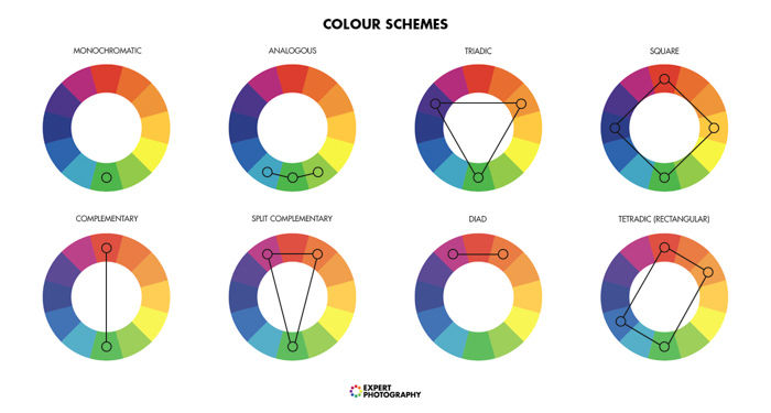
From there, you could refer to the color wheel to figure out what is the best color combination to your favorite color. It could be analogous, complementary, triadic, or other combinations showcased in the picture above.
In any case, don't be too concerned about the level of contrast in here ― that could be balanced out through the pairing of different accessories in your outfit.
Next, you could think about whether you are more of a suit person or a separates person. You could also be both actually, especially if you dress in different style throughout the week.
For suitings, the question you would always want to ask is how subtle do see yourself? I like to use pink as an example since it is in many ways the 'loudest' color I could think of; yet at the same time, you could be quite elegant if you do it correctly.
What you could see from the collage above is three Holland & Sherry suiting cloths that feature different levels of pink. Of course, if your personal approach to classic menswear is very bold and loud, you could always go for the one on the furthest left, which is from the Royal Mile 1976 bunch.
But most men don't do that. The key is that just because a particular color is the main color in your palette doesn't mean it needs to be the primary color of your suit. You could have a whole closet of suits that come in a different shade, but as long as all of them feature a tint of your favorite color, your wardrobe would still be functional.
Thus, as you could see the two cloths that follow afterward are much more understated despite having a tint of pink in them. In my opinion, you could even wear them to traditional office environments.
In fact, I have actually acquired a cut length of the last one since the cloth looks more like royal purple from a distance, which is currently my favorite color. (More on that in a future article.)
In any case, it would be even easier to pull off separates in bold colors since they are essentially more causal.
The image above from New and Lingwood showcases a very English summer look. Pair the pink trouser with a fairly traditional ensemble (navy blazer with a wine knitted tie) on your upper body so you could display a little bit of personality while remaining subtle. A pink corduroy trouser could also be a great winter equivalent of the former shall you want to liven up during the colder seasons.
And if that's not your style and you want to be more casual, you could even match a soft-shouldered, pink corduroy jacket with oxford shirts and denim trousers, or a soft pink cashmere jacket with a beige/ blue/ grey cotton or flannel trousers.
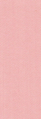
In fact, the pink wool/ cashmere cloth (Sherrykash 9019606) from Holland & Sherry featured below is actually quite a nice option if you were to go towards this direction.
Just remember, however, if the color you have chosen doesn't work quite well with your complexion (and given that you want to take that as a consideration), it would always work better as trouser than something close to your face.
Hopefully, by this point not only would you be able to build a wardrobe based on colors that feel personal and authentic to you, but also a way that you could make it more sustainable.
We continue to look at how to build a sustainable wardrobe from another perspective in the next entry. Bye for now.
Photography: as stated, otherwise by The Suitstainable Man Team
Further readings:
For more information on color analysis for men, check here.
For a more comprehensive guide on the 12 seasons color theory, check here.


Comments